How I won the best innovation product award in healthcare hackathon
Written on: April, 2025
•12 min readPicture this: It's 3 AM, the room's buzzing with energy, and I'm sitting there with my team, eyes heavy but hearts full. This was my first hackathon, and let me tell you - I was nervous as hell, but deep down, I knew we had something special. The kind of feeling you get when you're about to drop a track that's gonna change the game. We walked into that healthcare hackathon with one mission: to build something real, something that could actually make a difference in people's lives. We weren't just coding for points or prizes - we were building for folks dealing with early-stage dementia, trying to give them back a piece of their independence. 48 hours to change lives? Challenge accepted.
Steps
- The Problem, The Challenge and The Solution
- The Team
- The Tech Stack
- UI Engineering & Design System
- Mobile-First Implementation
- The Winning Moment
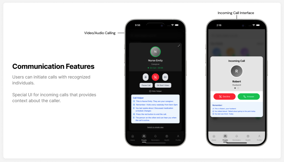
Let's keep it real - dementia ain't just about forgetting where you left your keys. It's about losing pieces of yourself, one memory at a time. We're talking about folks who struggle with the basics - remembering to take their meds, keeping track of appointments, even finding their way home. And their caregivers? They're out here carrying the weight of the world, trying to keep their loved ones safe while dealing with their own stress and anxiety. That's where "Momento" comes in - our answer to the call. We designed a PWA that's more than just another app. It's like having a personal assistant that really gets you, helping identify familiar faces, keeping you on track with meds and activities, and giving caregivers that peace of mind they deserve. The real magic? We built the app to understand people. It's about giving folks their independence back while making sure they're safe. That's the real win right there.
Our squad was six deep - five brilliant women with the vision and me bringing the technical execution. This wasn't about solo glory; it was chemistry in action. They understood the problem deeply, having personal connections to dementia care, while I had the technical skills to translate their insights into working code. This mix was our secret weapon. They brought the domain expertise and user perspective, challenging my assumptions at every turn. I kept us grounded in technical reality, pushing back when ideas weren't feasible in our timeframe but always finding alternatives. This balanced dynamic is what made our solution so compelling - technically sound but deeply human-centered.
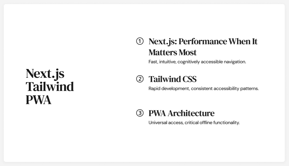
For the tech foundation, I locked in NextJS for three specific reasons: server-side rendering for performance, built-in routing for quick feature development, and incredible PWA support. TailwindCSS was non-negotiable - it's my secret weapon for rapid UI development. The utility-first approach meant I could build complex interfaces without context-switching between files. This inline styling approach saved crucial hours we couldn't afford to waste. Shadcn UI components gave us consistent, accessible UI elements out the box. Since they're built on Radix UI primitives, they came with proper ARIA attributes and keyboard navigation - essential for our accessibility requirements. State management was handled through React Context API - simple but effective for our needs without the overhead of Redux. For offline data, I used IndexedDB through Dexie.js for a clean API that simplified storage operations.
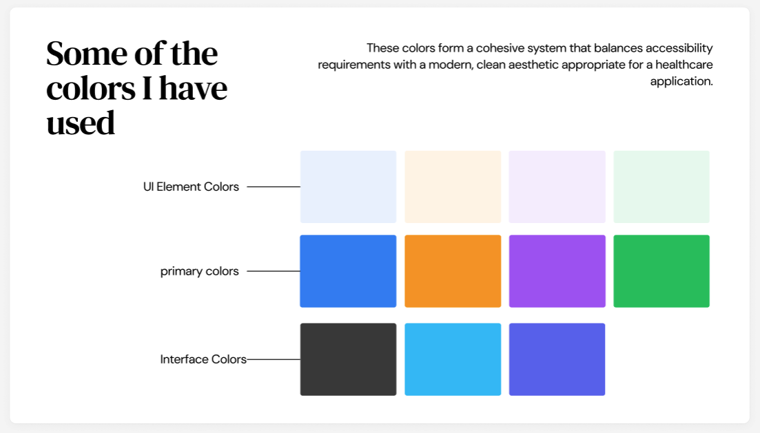
When you're building for people with cognitive challenges, your UI isn't just about looking pretty – it's literally the bridge between them and their independence. I knew we had to nail this part. First thing I did was develop a color system with purpose. We're not just throwing random colors around – each one communicates something specific: Blue for the People section – conveying trust and reliability when identifying loved ones. Warm orange for Reminders – creating gentle urgency without causing anxiety. Purple for Health features – suggesting creativity and mindfulness for cognitive exercises. Green for Settings – signaling safety and permission. These weren't arbitrary choices. Research shows color perception remains relatively intact even in later stages of dementia, making color coding an effective navigation aid. I tested each color for appropriate contrast ratios (minimum 4.5:1) to ensure legibility. For typography, I went with Geist – not because it looks dope (though it does), but because it's incredibly legible even on small screens with excellent character differentiation. I implemented a fluid typography system using CSS clamp() to ensure text remained readable across devices without manual breakpoints. The minimalist approach wasn't just an aesthetic choice. Each screen serves exactly one purpose with focused call-to-actions. I kept the visual hierarchy crystal clear with generous white space, high contrast between elements, and consistently positioned navigation. When your cognitive processing is impaired, predictability becomes a lifeline. One of my favorite design solutions was the memory cue screen. Rather than just showing basic information, I added contextual cues: "This is Sarah, your daughter. You talked about her cat yesterday." These prompts create connections that strengthen memory – turning our app from a simple tool into actual cognitive therapy.
Building a PWA that works seamlessly across devices while maintaining core functionality offline was our priority. I implemented the PWA architecture using next-pwa, configuring service workers with network-first strategy for critical data and cache-first for static assets. The manifest.json was configured for a standalone, portrait-oriented experience with custom icons for all required sizes and an iOS splash screen. Every interaction was designed for touch with minimum target sizes of 44×44 pixels following accessibility guidelines. The notifications system was crucial for medication reminders. I implemented a redundant strategy using both the Notifications API and in-app alerts to ensure critical reminders break through regardless of device settings. For performance optimization, I focused on the core web vitals: implementing code splitting with dynamic imports, preventing layout shifts with properly sized images, creating responsive typography with CSS clamp(), debouncing non-critical event handlers, and lazy-loading offscreen content with intersection observer. The judges were particularly impressed by how smoothly the app ran even on older devices – something our target users are more likely to own.
When they called "Momento" as the Best Product winner, I swear time stood still for a second. The team erupted – hugs, tears, the whole nine yards. But what hit me hardest wasn't the trophy or the prize money. It was when one of the judges, a neurologist who specializes in dementia care, pulled me aside and said: "This isn't just clever code – you've built something that understands what these patients and their families are going through. The technical implementation is impressive, but the empathy behind your design choices is what makes this special." That moment right there? Worth more than any line on my resume. The judges cited three key factors that put us over the top: our accessibility-first approach that directly addressed cognitive challenges, thoughtful implementation of memory cues, and Progressive Web App architecture that eliminated barriers to adoption. When your UI is so clear that someone can pick it up without guidance – that's when you know you've hit the mark.